- Ease of setup via web or smartphone app
- Detachable antennas
- Good value for money
- Status LEDs in awkward placement
- Standard issue design
Setting It Up in 1, 2, 3, 4…
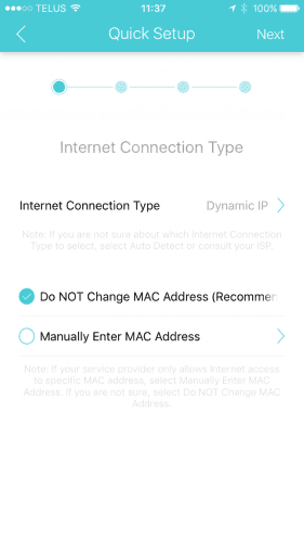
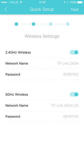
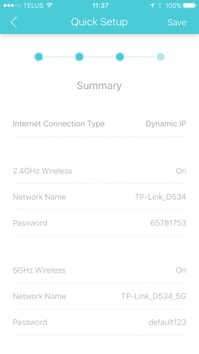
There are two options when it comes to setting up the TP-Link Archer C2300: either through their Tether Smartphone app or through the web-based user interface. Since I had issues with the Tether app with my TP-Link Archer C3200, I thought I would give it a try with the C2300 this time.
TP-Link Tether Smartphone App
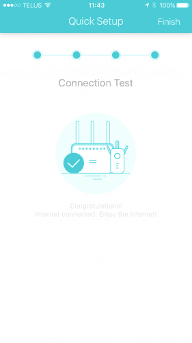
In a previous review of ours where we looked at the TP-Link Archer C3200, I was never able to log in to the C3200. So of course I wanted to see if I could use it with this device. I don’t know what it is or what has changed but I can finally make use of the Tether Smartphone app with this router! Setting up the Archer C2300 was a breeze and only took 4 screens.
All done and ready to go!
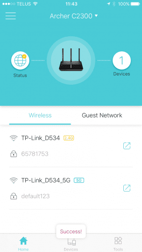
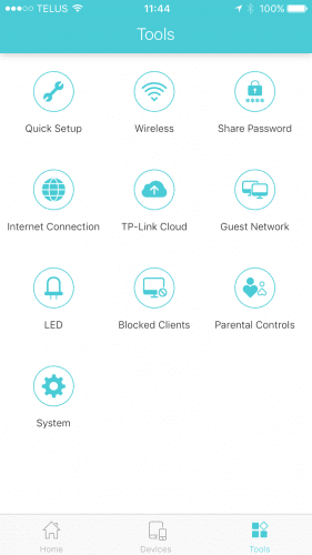
It has a similar feeling to their web-based user interface, which makes it easy to use. I also found out that only one person can be access device’s configuration screens from the web-based UI or through the app. You will be presented with a dialog that says that someone is logged in on another device and you can close that session and open one for you. Great for ensuring only one person is ever changing settings at any given time.
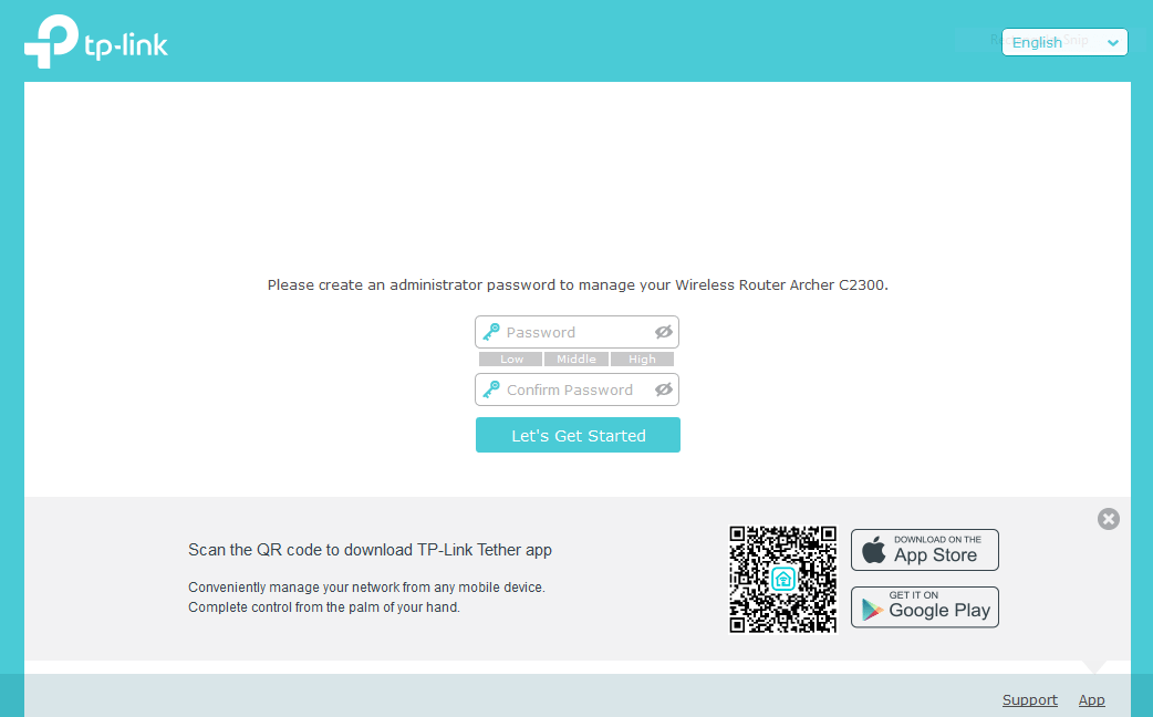
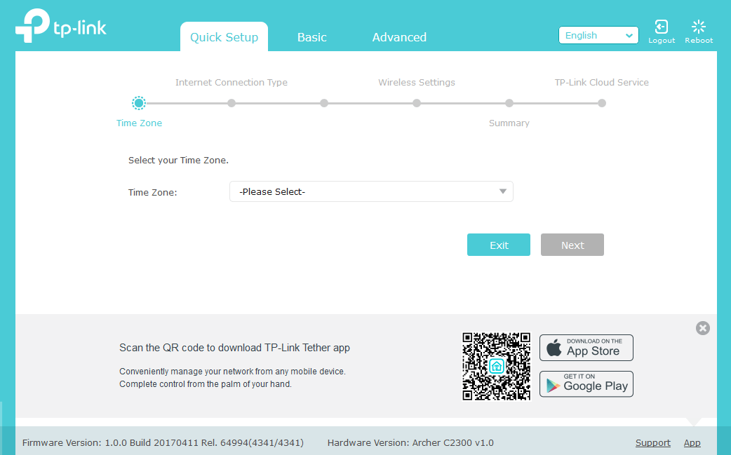
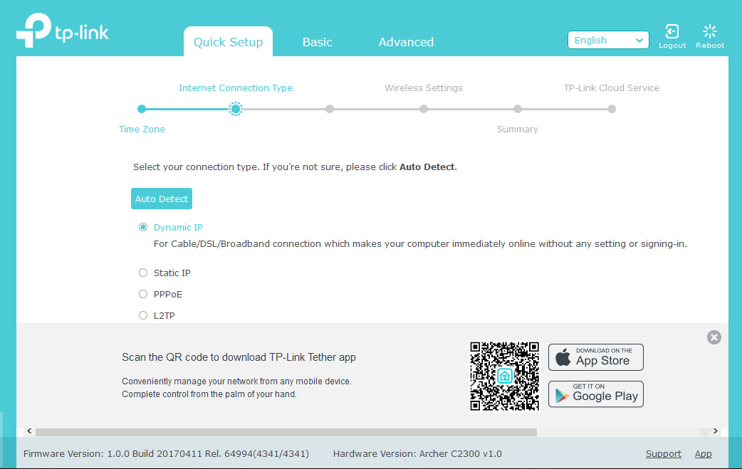
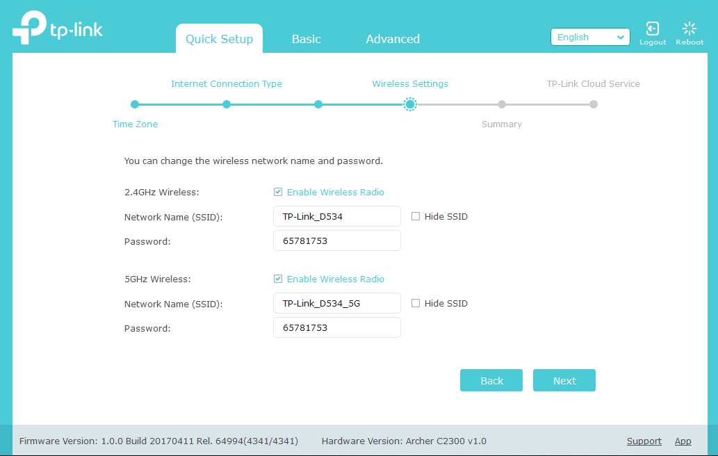
Setup Through the Web User Interface
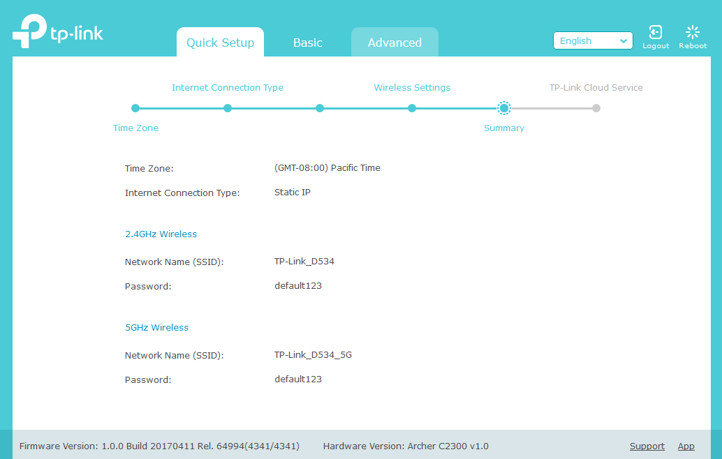
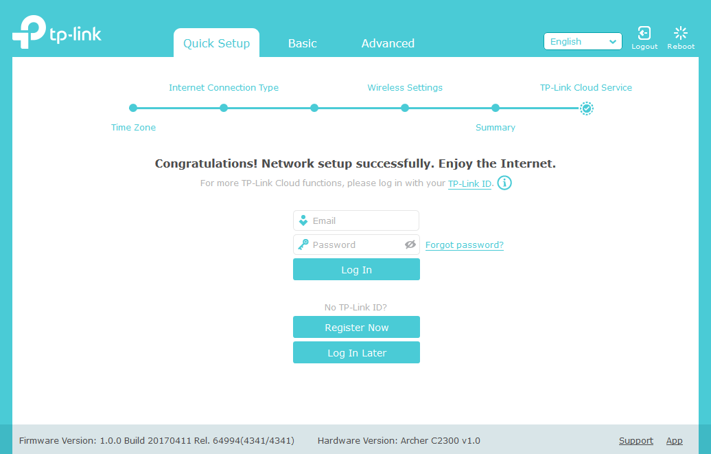
If you cannot download the Tether app, you can still set up the TP-Link Archer C2300 via your web browser. You just associate your computer to the default SSID of your device and log in to the IP of 192.168.0.1.
In my particular setup, I needed to specify a Static IP but the setup screen is essentially the same flow as the Tether Smartphone app setup.
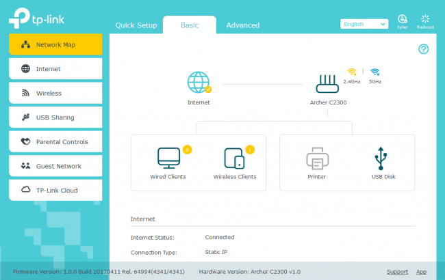
One you have logged in, you are presented with a screen that is similar across the TP-Link router family. It’s clean and simple, which is great! Nothing to scare a timid end user. One thing I noticed right off the bat though is the colour they use for a connection to the Internet; yellow. To me, yellow makes me thing there is something wrong or it isn’t 100%. There doesn’t seem to be anything wrong in this case; it’s just part of the colour scheme they use for this particular theme.
It would have been nice if they used green, as every time I look at the screen, my first instinct is that something isn’t quite right when it shows yellow.

