The old adage reminds us that a picture is worth a thousand words, so a video has got to be worth millions of words. The trouble is trying to find a suitable video editing program on the PC that is simultaneously easy-to-use yet robust enough to give you all sorts of flexibility and features. In my quest to become the next James Cameron or Martin Scorsese, I had the opportunity to give Pinnacle Studio Ultimate Collection a try. Version 14.0 is supposed to bring several enhancements over previous editions, but will it help me film the next Avatar?
What’s New with Version 14?
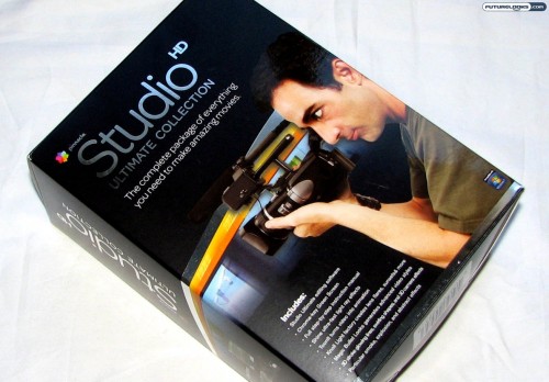
Let’s get one thing clear. Pinnacle Studio HD is not supposed to be a professional movie editing program, but it is supposed to be at the higher end of the consumer scale. It gives a professional look without the utter complexities that true professional software provides.
In Version 14, you are treated to such features as motion titling, image stabilization, over 80 Montage templates, stop-motion capture, straight sharing to YouTube, improved AVCHD support, and a full suite of Hollywood-style animations, transitions, and effects. You can thank the Red Giant plug-ins for some of that.
If these built in transitions and effects aren’t enough, Pinnacle also markets a whole range of creative add ons. From new text to transitions to special content, the software is meant to grow with you as you discover your talents. This makes it possible to create some very good looking video without having to create all your own assets from scratch and are compatible with the whole software line up.
Looking Inside the Box

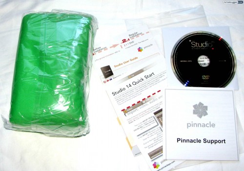
While this is largely geared as a software product, when you opt for the Ultimate Collection, you get an interesting bonus that is not included in the two other versions of Pinnacle Studio HD. Sure, there is the regular DVD software disc and all the supporting documentation that you need, but you’ll also notice the large green canvas. This chroma-key green screen can be used to complement your creative style. Theoretically speaking, one could create their own “avatar-like” sequences on a budget. Or not.
The Standard User Interface

Considering that I am coming from the perspective of using Windows Movie Maker, it’s understandable that Pinnacle Studio HD is remarkably more robust than that pre-installed solution. It’s also much more powerful than the FlipShare software that comes with Flip Video UltraHD pocket camcorders.
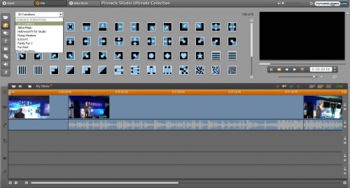
The plain grey background gives this program a professional appearance and it feels like everything is within easy reach. You can see the multiple timelines along the bottom for your video feed, text and titling, sound effects, and music soundtrack. Along the left side is a toolbar for access to the different features and the preview area is located to the right. To the top are the three steps you need to concoct your creation: import, edit, and make.
This layout is reasonably straightforward, but there is a natural learning curve with any kind of video software. For instance, I found it easier to right-click in the title timeline to add text rather than use the text tool from the toolbar in the upper-left. Luckily, Pinnacle does offer a number of online tutorials that you can refer to for more training. The better you get with these tools, the more creative you can be.
Dashing Through Transitions

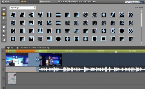
As mentioned, there is a clear learning curve to Pinnacle Studio HD. For the transitions button (second from the top), you get a pull-down menu to choose between different kinds of transitions. I stuck largely to the plain old 2D transitions, but you can get a lot fancier with Hollywood-style effects and Montage themes too.
It also took me a little to realize how to adjust the volume on the audio track, mixing the sounds from the video file with the background music soundtrack file. In the screenshot above, you can see a yellow line in the audio portion. You can grab any part of this line to drag it up and down, fading in and out as you see fit.
