PalmOS: Welcome to Last Decade

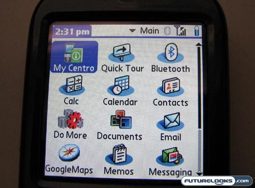
The Apple iPhone boasts an incredibly slick operating system. The HTC Touch Diamond gets the cool TouchFLO thing overlaying a Windows Mobile core. The Samsung Instinct has a proprietary user interface that is fresh and innovative. Unfortunately, the operating system found on the Palm Centro is none of these things. Instead, it reminds me of the Palm m500 PDA that I had many years ago.

The icon arrangement has remained largely unchanged, displaying the applications as a series of icons on a grid. You can swap between the different sets by hitting the home button. It’s a functional OS, but Palm seriously needs to consider something new. I know that there are models of the Treo that do Windows Mobile. That could be a step in the right direction, but I imagine that they went with the dated OS because it’s a leaner installation for the Centro.

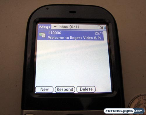
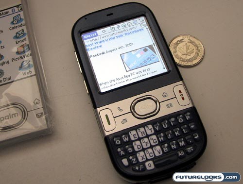
In addition to the main menu, you can also access the rest of the functionality through the four buttons located in the silver strip in the center of the phone. The home button gets you to the main menu, as mentioned, whereas the Message button (envelope) takes you to, you guessed it, the messaging app. There is also a quick access button for the schedule and phone apps.

I would have preferred quick access to the Blazer web browser, but it could be that soccer moms and other types leaning toward the Centro wouldn’t be as inclined to invest in an expensive data plan. They’re more likely to use the scheduler to keep track of dentist’s appointments and the like.
Real-Time Price and Stock Check – Find More Products Here
