Menu Navigation
Another gripe that people had against the original Zune was the menu wasn’t the easiest thing to navigate. The text was very small, despite the device having such a large display. Thankfully, Microsoft addressed this issue in the new Zune, substantially increasing the size of all screen elements. Take a look at the main menu!
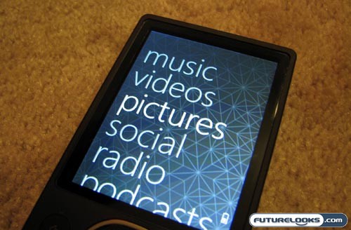
That’s monstrous. Going down the main menu, you’ll find quick access to music, videos, pictures, social (wireless sharing with nearby Zunes), radio (FM), podcasts, and settings. Everything is arranged in a reasonably intuitive manner and you are also able to set your own custom wallpaper, just like you woud on a cell phone.
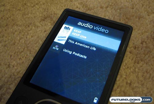
The podcast integration is a particularly nice feature, because up until now, no MP3 player has truly been able to compete against the iPod on this front. Users can easily subscribe to a variety of audio and video podcasts through the Zune Marketplace and they all show up through this section of the menu. Music can be selected based on song title, genre, albums, artists, or playlists. On the page of any song, there is an option to add it to the quick list. Handy!
Big Videos, Big Album Art
The 3.2-inch display on the Zune 80GB is certainly used to its fullest potential. When playing any given song, the album art takes up about two-thirds of the screen. The bottom third is used to display the song title, artist, and album, as well as basic icons for battery life, shuffle, repeat, and so forth. I have a feeling that such a large display pulls a few hours away from the battery life. Leaving the Wi-Fi radio on can further reduce the battery life.
In a real world test, the Zune 80GB lasted for about 23 hours of uninterrupted audio playback, whereas common benchmarks on the web say that the iPod Classic can pull off about 45 hours. I can’t say for sure, but the battery life on the smaller Zune 4GB and 8GB will probably be better, largely thanks to the Flash memory used in those units (the 80GB has a hard drive).
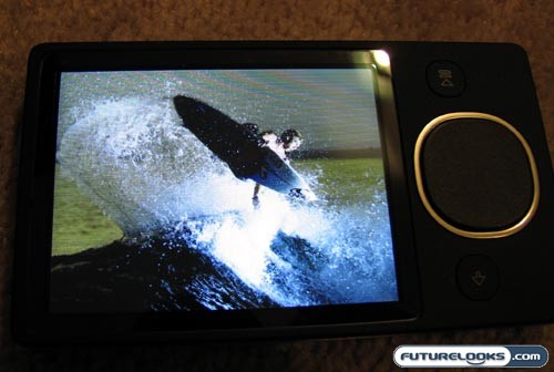
Watching videos on such a large display is quite enjoyable, because you hold the Zune on its side for a landscape orientation. This is perfectly watchable for video podcasts, television recording, and even feature-length movies. I wouldn’t recommend watching a three-hour Peter Jackson epic on this, but a brief Judd Apatow comedy will be perfectly watchable. Strangely, the 3.2-inch screen only has a QVGA (320×240) resolution. The picture quality would be loads better with true VGA (640×480). The colors are also a little muted.

