It really wasn’t all that long ago that smartphones were virtually the exclusive realm of corporate types, but that has very much changed in recent years. Whereas Windows Mobile once held a strong foothold in the market, Microsoft has since lost out to the likes of BlackBerry, iOS, and Android. Fighting back, the software giant has unleashed Windows Phone 7 upon the world. Windows Mobile 6.5 represented a baby step forward compared to Windows Mobile 6.1 and Windows Mobile 5.0 before that. With Windows Phone 7, Microsoft is starting fresh with a consumer-oriented smartphone OS. Can it challenge the Googles and Apples of the world? Let’s find out.
LG Optimus Quantum Test Subject

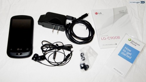
For the purposes of this review, we’ll be taking a look at the LG-C900B, which is otherwise sold as the LG Optimus Quantum in several markets. In Canada, for example, you’ll find this phone carried by Bell Mobility. Here’s a quick video of us unboxing it and going through some of the features:
Certainly, there are other Windows Phone 7 devices on the market and they each try to offer their own unique selling propositions, but the OS is largely the same; Microsoft isn’t allowing much in terms of customization for the time being, but like Android (which got HTC Sense, Samsung TouchWiz, and so on), this may change in the future.
The LG Optimus Quantum comes with a 3.5-inch TFT touchscreen, tri-band UMTS, quad-band GSM/EDGE, slide-out QWERTY keyboard, five-megapixel camera (with 720p video), 16GB internal memory, FM radio, 802.11b/g Wi-Fi, and Bluetooth connectivity.
Say Hello to Windows Phone 7

There are a lot of different smartphone platforms these days, all with their respective advantages and disadvantages. That said, Windows Mobile clearly fell behind the curve and Windows Phone 7 is meant to rectify that.
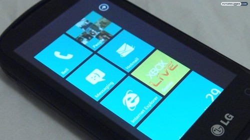
In terms of first impressions, Windows Phone 7 is a lot cleaner and simpler compared to its predecessors. The “Live Tiles” homescreen is particularly appealing in its 2D presentation. Each tile can be a shortcut, but some can act as “live” widgets, letting you know when you have a new text message or e-mail, for instance.
As the television spots lead you to believe, the idea is that you can “get in and get out” as quickly as possible. For the most part, this is true. They’ve also highly simplified the overall presentation, using Zune-like fonts and pervasive multi-screen interfaces. It’s really quite elegant, especially compared to the comparatively “clunky” Windows Mobile 6.5.
Still on the Learning Curve
The good news is that Microsoft’s new smartphone platform is far less intimidating and far easier to use. The bad news is that it’s possible Windows Phone 7 goes too far into the “dumbing down” end of the pool.
For example, there is no capability to use your own custom ringtones. You are forced to choose from a set of pre-loaded ringtones. Similarly, you will not find the ability to copy-and-paste anywhere in Windows Phone 7 either. It’s also a shame that the main menu, which is accessed by swiping right-to-left on the “live tiles” home screen, is only a single column. The home screen is only ever shown in portrait mode too; other apps may rotate to landscape, but not the home screen (and not some other apps too).
Considering that the first generations of iOS and Android had their fair share of shortcomings too, I’m willing to give Microsoft the benefit of the doubt and say that they’ll be addressed in future versions. Windows Phone 7 shows a lot of promise, but it’s not quite there just yet.
Virtual and Physical Keyboards
Using the LG Optimus Quantum as our test subject, I went about typing out a variety of different things via Windows Phone 7. I composed e-mail messages, sent text messages, updated my Facebook status, and so on. This was done using both the virtual on-screen keyboard and the physical slide-out keyboard.
As I am partial to hardware keyboards, I found that option to be much more appealing. That said, the keys were too “smooth” and flush with the surface to provide the kind of tactile feedback that I prefer. Since some apps don’t auto-rotate to landscape mode, as mentioned earlier, this made for some strange typing situations too. This must be corrected as it only serves to ruin the user experience. But non keyboard phones should have less of an impact.
When it came to the software keyboard, I’d say the response was similar to the iPhone and Android phones. It did the job it needed to do and the LG-C900B offers haptic feedback too. This vibrates the phone ever so slightly with each virtual key press, giving you the illusion of a tactile sensation.
Social Media and Other Functionality
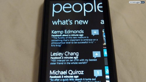
As can be expected with any modern smartphone, Windows Phone 7 is perfectly capable of handling all your social media desires. Facebook and Twitter do not come pre-installed, but there is something called “People” that can draw in your friend’s contacts and updates through Facebook and Windows Live. Oddly, you can’t comment or “like” any of these updates through “People.” That’s a strange disconnect. Thankfully, it’s not hard to find the official Facebookk and Twitter clients through Windows Marketplace. That’s also where you can download games (which show up under the pre-installed Xbox Live app), music (which get connected to the pre-installed Zune app), and more.
The Windows Phone 7 Facebook app is pretty interesting in how it displays your friend’s pictures, almost mirroring the tile-like appearance of the homescreen. The Zune-like fonts continue through both here and on the official Twitter application too. Naturally, third-party alternatives will evolve and grow with the times too.
Just as the iPhone ties into other Apple products and Android links up to your Google accounts, the same can be said about Windows Phone 7. Your default e-mail is through Hotmail. Your music is managed by Zune. This is both good and bad, of course, especially when it comes to the Bing default search engine (which you can’t change, but you can bookmark Google in the web browser).
Closing Thoughts
Considering where Windows Mobile found itself last year (along with the Kin), Windows Phone 7 is a monumental step in the right direction for Microsoft. It’s much more in line with the socially connected times and they’ve done a great job with making an aesthetically-pleasing interface.
The way that you make your way around social media is so much better than the silly TimeScape thing on the XPERIA. The live tiles are functional, simple, and attractive. By abandoning fancy visuals and going with clean yet brand-specific font styles, Windows Phone 7 certainly has a personality of its own. But it’s far from a perfect package.
The lack of copy-and-paste is odd. It’s also strange that you have to tap near the top of the screen to see your remaining battery life and signal strength; those should be persistent, at least on the home screen. While Android and iOS are both currently superior to WP7 in many ways, Microsoft has built itself a solid new foundation to grow and move forward. And come January at CES 2011, rumour has it that many of the current drawbacks of this OS will be alleviated. I guess we’ll see when Futurelooks hits the CES Show Floor in January.
Pros
- Very clean and simple interface
- Live tile homescreen is attractive and effective
- Heavy integration with other Microsoft services
- Generally speedy and peppy
Cons
- Heavy integration with other Microsoft services
- No cut-and-paste, copy-and-paste
- Only choose from pre-loaded ringtones
- Might be too simple for higher-level users
Overall Rating: 7.5/10
Love This Review? Hate This Review? Leave a Comment or Hit The Forums!
Windows Phone 7 Smartphone OS – Photo Gallery

