It really wasn’t all that long ago that smartphones were virtually the exclusive realm of corporate types, but that has very much changed in recent years. Whereas Windows Mobile once held a strong foothold in the market, Microsoft has since lost out to the likes of BlackBerry, iOS, and Android. Fighting back, the software giant has unleashed Windows Phone 7 upon the world. Windows Mobile 6.5 represented a baby step forward compared to Windows Mobile 6.1 and Windows Mobile 5.0 before that. With Windows Phone 7, Microsoft is starting fresh with a consumer-oriented smartphone OS. Can it challenge the Googles and Apples of the world? Let’s find out.
LG Optimus Quantum Test Subject

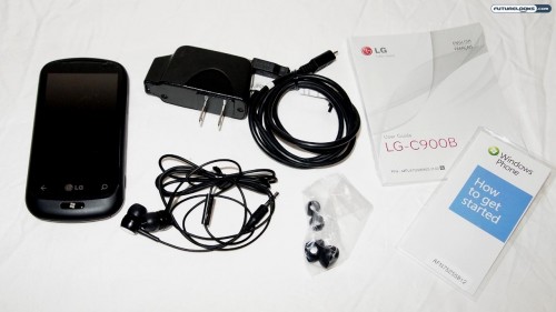
For the purposes of this review, we’ll be taking a look at the LG-C900B, which is otherwise sold as the LG Optimus Quantum in several markets. In Canada, for example, you’ll find this phone carried by Bell Mobility. Here’s a quick video of us unboxing it and going through some of the features:
Certainly, there are other Windows Phone 7 devices on the market and they each try to offer their own unique selling propositions, but the OS is largely the same; Microsoft isn’t allowing much in terms of customization for the time being, but like Android (which got HTC Sense, Samsung TouchWiz, and so on), this may change in the future.
The LG Optimus Quantum comes with a 3.5-inch TFT touchscreen, tri-band UMTS, quad-band GSM/EDGE, slide-out QWERTY keyboard, five-megapixel camera (with 720p video), 16GB internal memory, FM radio, 802.11b/g Wi-Fi, and Bluetooth connectivity.
Say Hello to Windows Phone 7

There are a lot of different smartphone platforms these days, all with their respective advantages and disadvantages. That said, Windows Mobile clearly fell behind the curve and Windows Phone 7 is meant to rectify that.
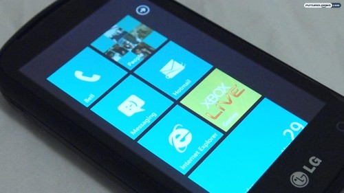
In terms of first impressions, Windows Phone 7 is a lot cleaner and simpler compared to its predecessors. The “Live Tiles” homescreen is particularly appealing in its 2D presentation. Each tile can be a shortcut, but some can act as “live” widgets, letting you know when you have a new text message or e-mail, for instance.
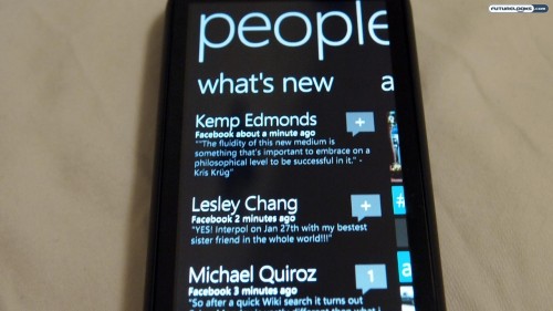
As the television spots lead you to believe, the idea is that you can “get in and get out” as quickly as possible. For the most part, this is true. They’ve also highly simplified the overall presentation, using Zune-like fonts and pervasive multi-screen interfaces. It’s really quite elegant, especially compared to the comparatively “clunky” Windows Mobile 6.5.
Still on the Learning Curve

The good news is that Microsoft’s new smartphone platform is far less intimidating and far easier to use. The bad news is that it’s possible Windows Phone 7 goes too far into the “dumbing down” end of the pool.
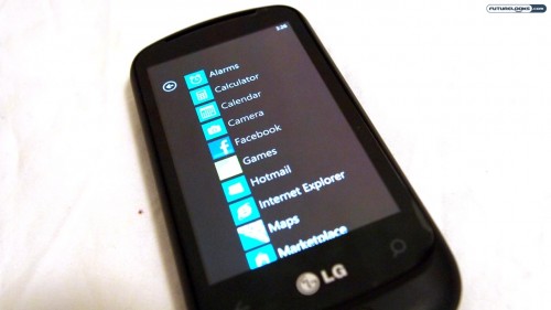
For example, there is no capability to use your own custom ringtones. You are forced to choose from a set of pre-loaded ringtones. Similarly, you will not find the ability to copy-and-paste anywhere in Windows Phone 7 either. It’s also a shame that the main menu, which is accessed by swiping right-to-left on the “live tiles” home screen, is only a single column. The home screen is only ever shown in portrait mode too; other apps may rotate to landscape, but not the home screen (and not some other apps too).
Considering that the first generations of iOS and Android had their fair share of shortcomings too, I’m willing to give Microsoft the benefit of the doubt and say that they’ll be addressed in future versions. Windows Phone 7 shows a lot of promise, but it’s not quite there just yet.
