A More Contemporary Appearance

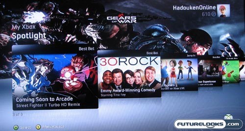
Although I never really had a problem with the original Xbox 360 dashboard, it did start to look a little dated when you compared it to the more fluid interfaces that you found on devices like the Apple iPhone. With the refreshed NXE, the Xbox 360 has received a whole new look and as a result, you’ll find it much more pleasing to the eye.
Instead of the distinct “blades” of old, the NXE consists of a series of flowing sections, almost like what you saw in The Minority Report with Tom Cruise. The main navigation near the top-left looks a lot like what you get on the Microsoft Zune and then each of these vertical sections consist of a series of horizontally-flowing subsections.
This is much more fluid and flipping through these subsections is similar to what you get with CoverFlow on the Apple iPod. It looks great and this aesthetic style is much more in tune with the prevailing design winds of 2008. We like fluid. We like flow.

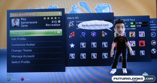
Even when looking at your own profile, the Xbox 360 gives you a series of sliding pages. This is much easier to read and navigate than the tired “list” format that it replaces. Further still, you are now able to remove games from your library for which you do not have any GamerScore points. We’ve all tried a few trials and borrowed a couple of games, so it’s great to clear the clutter. You can also see all the achievements that you have yet to earn.
Quick Launch, Media Player, Netflix Streaming…
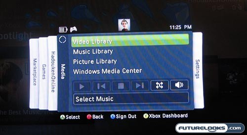
Previously, when you hit the Xbox button on your controller, you’d bring up a rather simple overlay that let you see how many friends were online and that kind of thing. The new Quick Launch menu is much more robust than that.

From this quick launch menu, which is similar in layout to the old “blades” Xbox interface, you can access almost everything that you could from the main Xbox dashboard. You can flip through to the marketplace, jump into your video library, adjust your settings, and even directly launch into another game.
This last function is utterly fantastic because you no longer need to exit your current game, enter the dashboard, find your game, and then launch it. Instead, just hit the Xbox button, find your game in the quick launch menu, and off you go. This is much faster and more efficient. It’s perfect for those times when your friends are starting to jump on Xbox Live for a session of RockBand and start messaging you to get in the game.

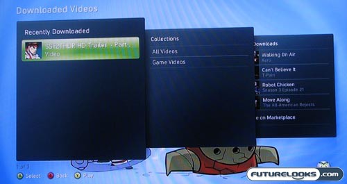
The media player itself has undergone a few upgrades too and I like how the downloaded videos section is now displayed in the dashboard. Even surfing through the files that you have on an external device (e.g., USB flash drive) is a much more pleasing experience. If you’ve got an American Netflix account, you can stream movies directly from that service as well.
Real-Time Price and Stock Check – Find More Xbox 360 Products
