Three Buttons For Everything

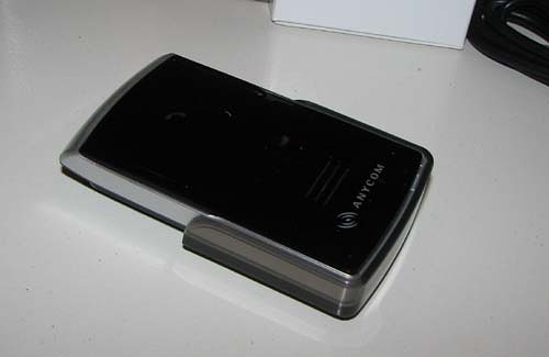
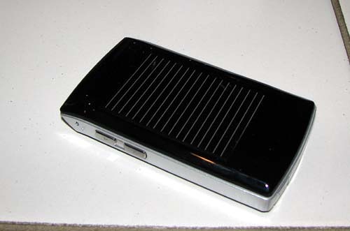
Some people may say that by limiting the number of buttons on this unit, Anycom has managed to simplify the user interface. Unfortunately, it’s quite the opposite. The three buttons include the main button on the face of the unit and the two volume buttons on the right side. When you get an incoming call, you answer it by pressing the main button “briefly”. If you hold the button for one second, it rejects the call. Hold the button for much longer than that and you turn the whole thing off altogether.

As you might be able to telegraph, it can get pretty frustrating if you accidentally hold the button for too long for it to be a pick up, ending up in a flush to your BFF. I personally would have preferred the standard interface of having two buttons for this purpose: One for picking up and one for hanging up, just like on your mobile.
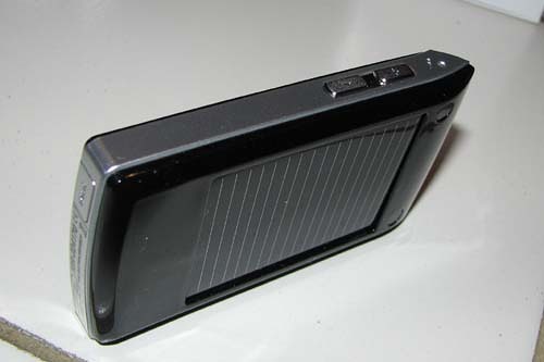
Moreover, by placing the volume buttons on the right side, they’re not nearly as easy to access as they could be. It might have been better if these buttons were either at the top section (where it says “Bluetooth”) or a little lower on the front face, maybe closer to the “Anycom” logo.
Gadget Thief Magnet

I don’t know about you, but I don’t feel particularly safe leaving all my precious gadgets out in plain sight when I leave my car in a parking lot. My car stereo has a removable faceplate, I take my portable GPS with me when I leave my car (or I hide it somewhere), and I would likely take this Bluetooth speaker with me when I park my car too. As a result, the solar panel becomes not nearly as useful as it can be. After all, the solar panel isn’t exactly exposed when you have it in your pocket. Or how about when you park underground?
Real-Time Price and Stock Check – Shop Like a PRO!
